notes.e-worm.club
I forked etherpad-lite, so my friends and I could have a collaborative docs app that was actually fun to use
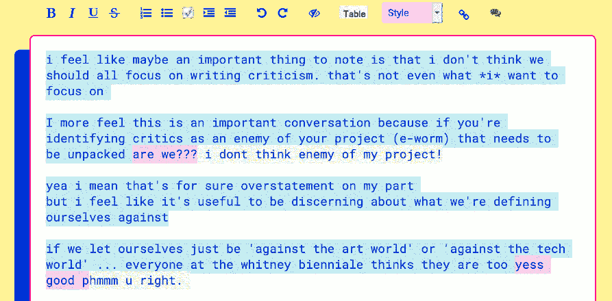
This wasn’t a particularly in-depth UX exercise, but it highlights how I use aesthetics to encourage certain modes of interaction. The original etherpad interface was plain and conservative, but we (the collaborators) are whacked out and radical. Aesthetics set the tone of interaction and I believe that they should mirror the goals of the interface, not fight it. The goals of this interface were (similar to e-worm.club) to create a space for radical, non-linear, collaborative thinking that would preserve those thoughts rather than cast them aside. These sorts of interactions would have been oddly dissonant with the original etherpad interface but were harmonious with (and even encouraged by) my version.
If "beautiful interfaces" were an objective standard than we wouldn’t have UI design trends— I choose aesthetics based on the feelings and interactions I want to encourage, not some handwavey notion of beauty or what’s popular on dribble.